Using Color Contrast in UI Design

Contrast is something that you should use very thoughtfully and sparingly in UI design. If you design an item with high contrast, it will draw a lot of attention to itself. That’s why I typically reserve high contrast for my action buttons on a user interface, or UI.
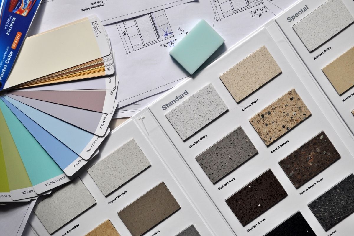
There are actually some interesting related design principles in online UX design education, I think from interior design. You can choose three colors for your UI, but make sure that your base color is 60% to 80% of the page. That base color should be something neutral and calm that doesn’t have high contrast.
Then you can pick two other colors to sort of help you draw attention to the things that matter to the UX. So, I would say use contrast sparingly in UX design and use it for the things that you really want people to act on and/or potentially look at.
