UX Design: Making Dynamic Prototypes

In the next stage, you add a little bit of dynamics to your prototype to figure out what is the best way to create this conversation. You start by looking at different elements, including animation, colors and images. By adding dynamics, you can also start to go to the specific person that you’re designing for to seek more input. After all, at that stage, you want to have a very specific scenario in mind as well.

UX Design Prototype Feedback

When you go to a person and you design a system, such as a map for a person who wants to go from Point A to Point B, the user flow that you create should have a very specific scenario so that you can have a person try out your system or the prototype. For example, they might try out one that has colors, one that has animation or one that is dynamic in other ways. The user can actually try to use that system to help them go from Point A to Point B.

If they’re successful, your prototype is successful. If they’re not successful, and more often than not they won’t succeed with your UI in the first few stages of the prototype’s design, you have to ask yourself: Where did they come across a UX problem? Did they fail when they tried to press a button because they interpreted the button as text and not as a button? Did they fail because they interpreted the image as something that conveyed too much information and looked more like text? Did they fail to enter the information into a text box because the text box was just too small?

These are the things that you can identify in your UI design with a digital, high-fidelity prototype. When you allow this type of interaction with one or more users, the results convey to you the exact areas in which your prototype is failing. You then have to decide how best to reverse course and quickly refine the prototype so that you can try again to see if a user can accomplish that task.

As you’re learning through your online UX design education studies, a prototype gives you the ability to do something that you don’t have to fall in love with and can even throw away. A prototype allows you to more successfully get to the goal of designing a simple pleasurable application.
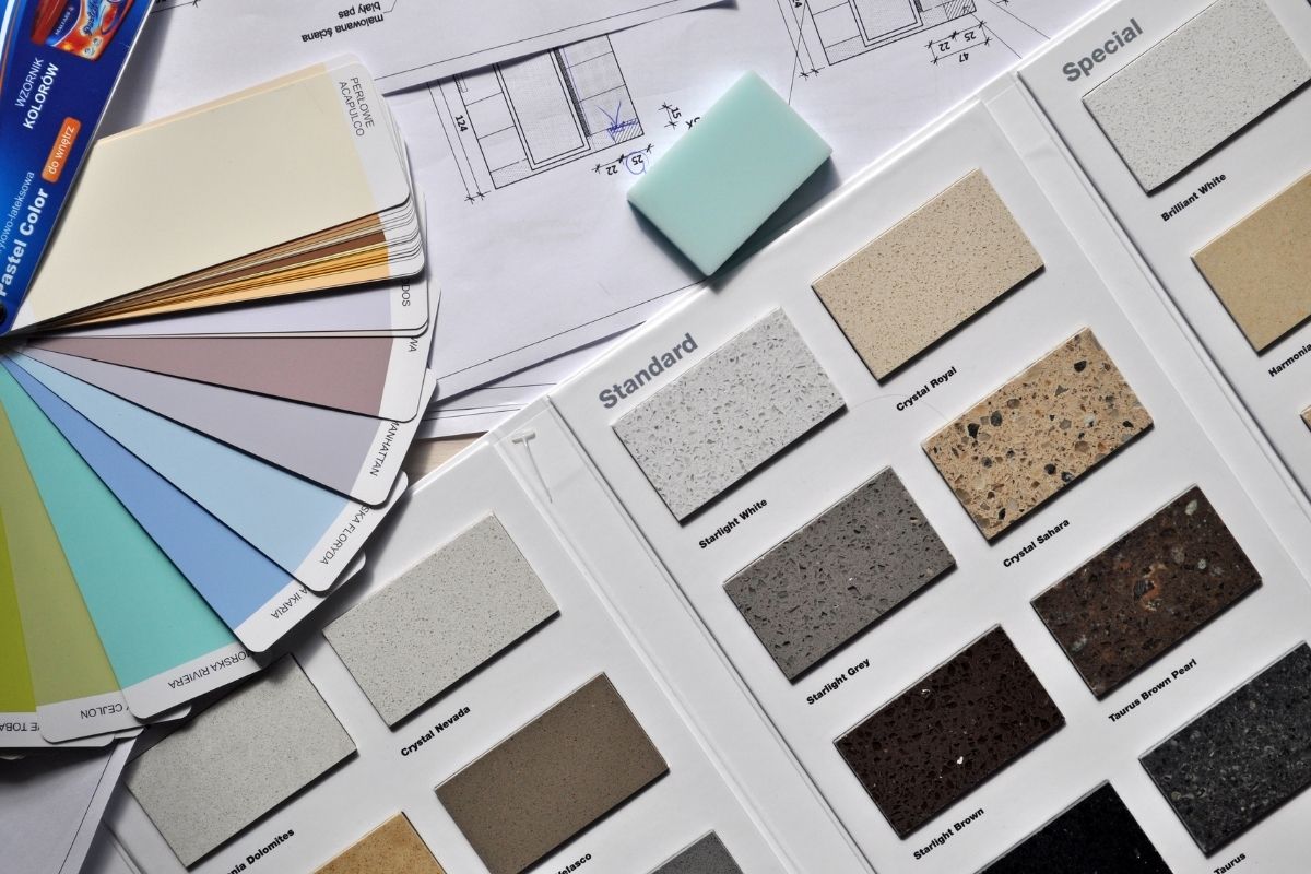
UX Design: Introduction to the Visual Design Module

In our module “Module for Visual Design,” the next level of UX magic starts happening.

It already started at the very beginning when you decided to tap into a problem that you wanted to solve, which shows that you have empathy and willingness to be of service with your work as a UX designer. But, now, let’s talk about the next step:

How do you communicate those ideas and services, products and solutions visually?

In this module, our experts explore all of the visual codes that are key to translating UX data, all of that information that you gather from different sources, into a viable user interface (UI). Visual UI design is not only attractive or aesthetically pleasing. It is useful, seamless and intuitive and directs the information in a seamless and effective manner. Visual design is all of that navigation. It is the buttons, colors, iconography and typography in a global context. All of these factors are very important to create a successful user interface.

This module outlines important, useful information that can help you succeed with your online UX design education studies and improve your chances of success once you pursue a UX design career.

UX Design Module: Introduction to Designing Test Strategies

Now that you’ve learned how to create an efficient plan for your user research, it’s time to implement all of that knowledge and learn how to choose the right test strategies to help you with the user research stage. In this module, our experts guide you in this process and help you to design test strategies. Again, we promote the best ethical practices during every stage.

As you progress, you will learn how to implement principles of equity, diversity, and inclusion in the world of UX and UI. You will learn why these are so important in the user research stage. Once you gather all of that information from user research, you can refer to the personas and compare data, which can help you create a user flow that allows you to inform your UI design prototype.

Online UX Design Education

During your studies, you receive many opportunities to expand your knowledge and increase the tools in your UX design toolbox. This module can really help you learn how to use the data you acquire as optimally as possible so that you can take your prototypes to the next level.

UX Design Introduction: The User Flow Path

User flow, also known as the user journey, is a really good tool to allocate pain points. It helps you to understand the typical actions of different demographics of users when they interact with an app or website.

You don’t look at the desired state. You look at the current one. The user flow helps the user organically move from their first step to their last one to complete a task via a user interface (UI).

For this UX design journey, you can really see where a user is having challenges. You can see where they are frustrated or possibly feel like they’re being told to do something that they’re not comfortable doing. The user flow maps for us the UX UI design interventions we need to use to create a solution for them, which means that the user flow is really a map to understand what we need to change and where exactly we need to change it.

Online UX Design Education

As you can see, you can understand problems with your UX designs during your design education studies and career years via simple tools like user flow. In this case, you simply trace the path of a user’s interactions with an app or website UI to find pain points.

UX Design Examples in the Real World

There are so many instances of UX and UI we can find in real life. Once you start your online UX design education, you’ll see UX design and UI design all over the place. One great example of UX design is a museum.

When you enter a museum, there are so many touchpoints. There are so many interfaces. Even UX comes in the form of those little QRs that you see next to the artworks. When you direct your phone camera to those, it doesn’t just bring you information, it acts as a portal to extending the information and to expanding the experience. That is a wonderful example of when these two worlds are merged together.

Museums are multisensory experiences. We walk through them. We circulate. There’s a path that is created for us to follow. There’s a way that we interact with the artworks, and even more important is the emotional component.

User experience relates to an efficient, seamless, intuitive navigation or journey, whereas experience design is about the emotional component as well. It’s about how you feel when you interact with this space. What is it that comes to your mind? What are your feelings, your emotions, that are triggered in these journeys through the physical space, even more so when they are connected and they are merged?

That’s when we have hybrid spaces, or what we could call “phigital” spaces.

UX Design and the Digital Experience

An online UX design education course teaches students how to shape the digital world for users. Talented designers know that user experience can make or break a program or platform.

Creating an Immersive Experience

What is user experience? In terms of software, it is the entirety of what an application feels like for the end-user. UX involves the story that is being put forward and everything that adds to the complete experience. It could be the way the sound is created, the way the choreography of this space is designed, as well as less obvious backend UI design decisions.

“Ultimately, what’s the story that’s being told? How does the user feel towards that?” asks Amir Bardaran. The designers give full recognition to the feelings that the end-user will have as they process and absorb the experience itself.

UX design professionals have a wider range than traditional 2D or 3D immersive platforms. New technologies like augmented reality and virtual reality provide environments that could incorporate a lot more than just a visual component. UX would include the feel, sound effects and atmospheric sounds. Possibly, you could even have a sense of smell added to that environment through the haptics.

So, what are the ways in which people can feel, touch and experience the pressure of things that are around them? That is ultimately what is meant by user experience. It is the overall engagement with the choreography of this space in the entirety of its composition.

Developing a Natural Experience in the Digital World

The book, “The Design of Everyday Things,” by Don Norman, is one of the first to use the phrase, “user experience.” In the book, Norman breaks down all kinds of things that people take for granted. He considers objects as simple as light switches and the history of their design.

“What are these conventions that we’ve now just come to realize are part of our lives? They feel intuitive to us. And what happens when you break some of those conventions and make it actually very difficult for people to use?” asks Daniel Holtzman.

A lot of what designers handle are UI and UX issues. They thoughtfully consider how to make things simple and clear, how to create analogies from the physical world to the digital world. The goal is to create connections between what people are seeing, what they are doing and what their desired outcome will be. These considerations make up the ultimate user experience.

Focusing UI Design on End Users

User experience was developed as a practice to create tools that centered around people. “Without user experience, we would just be creating tools for ourselves instead of for other people. In general, I think it has given companies a competitive edge because the more you care about the people who use your products, the more successful your products are going to be,” says Daphne Lin.

Utilizing Product Design Education to Break Down a Brief

“How projects come in is incredibly varied,” says Kate Hixon. “Oftentimes you’ll get a call with someone who thinks they want one thing. As you speak to them about what their needs actually are and what their problem is that needs to be solved, the result or the solution becomes something quite different.” There are other times where it is really specific and you’re just fulfilling a brief for that particular product design. Hixon continues, “I’d like the client to be involved in the product development discussion about crafting what the issue is so that the solution is something that really resonates with them. In terms of how to start once we have a brief, is we try to just frame it in the broadest context possible.”

“You receive a design brief,” explains Jean-Jacques L’henaff. “You receive a timeline and you work with different departments and coordinate with them. When I was working at Dreyfuss, we had an exceptional situation where we were so early in the projects that we were actually able to define the interior of the plane and dictate the fuselage, which is very unique in the industry.” He goes on to say, “In comparison, when we work, for example, in my current occupation at LIXIL, we can work that way when we receive a design brief because it is part of an initiative that is company-wide and has been led by, defined by, the marketing team. Sometimes we also initiate our own research and discover opportunities for new products and new technologies in our industry. That last type of project is very interesting because that’s when you really have projects that are truly user-centric and insight-led. Usually, the outcome is much, much more innovative and much more interesting.”

These are the two main differences that you have, as explained in online product design education. “I would say,” L’henaff demonstrates, “we get a strategy or marketing-led initiatives and we get a brief. Sometimes we actually gather insights and from there go and suggest a type of product and work with the other department to develop it.”

Using Online UX Design Education to Find Creative Solutions

“The way that we start UX Design projects-or how we build products-in all of the UX roles that I’ve worked on is typically focusing on people and determining what are those people’s needs,” says Pilar Serna. “Like sometimes, people have a need to do something better. Or perhaps, they have a current pain point. So we try to do lots of research at the beginning of every project to really understand what are those UI needs, and what are the pain points and opportunities in order to start elaborating a solution for people.”

“So the UI Design process is very human-centric, as we say,” continues Serna. “And there is always a moment where the team gets together, and we do a kick-off and alignment. That’s when we try to really understand what the problems are that we are going to solve. And a big part of this is continuing to do this research and talking to people so that we can better understand what their needs are. What are the opportunities that we can tackle? Every project is different. The process is very diverse depending on the kind of solutions that we’re bringing.”

“So, usually, when a client comes to me, they have a particular problem that they want to solve. They don’t always know what it is, but they definitely have a need,” adds AJ Camara. “And the whole idea is that I need to help them solve that problem and ultimately help them reach their goals. The process starts off with a discussion, just getting to know the client and getting to know some of their day-to-day business, the ups and downs, what’s working for them, and what’s not working. And then from there, I look into how we can dig deeper. And then we go down a path of trying different things that, ultimately, help them achieve that goal.”

“Since the problem is not always what they think it is, there’s a lot of iteration involved,” Camara continues. “Someone might think that, for example, their website needs a redesign of their homepage, but the real problem might be that their product page has a button that doesn’t work. So some of these different things are what we dig into, as we go down this path of exploration, and figuring out what the true solution is for their problem. And, throughout that process, the conversation, essentially, continues, and it goes down different paths.”

Using Contrast in Designs

As a young designer, I remember working on traditional print media with the founder of our company, and it was the fashion to use small types and colors of similar value. It was just a design move, and it was something that we fell into with as a stylistic choice.

I remember the founder of our company going, “What does that say? I cannot read that.”

I had to step back and really think about understanding the audience’s visual acuity and the differences in people’s ability to see in contrast.

At that age, I didn’t need glasses, but now I have to wear glasses to read. I take my glasses off often when I’m looking at a screen just to see if I can see how easy it is to read or not. I think that that’s been a test for me because contrast is everything. It’s the component or ingredient that needs to be scaled and balanced with all of the other elements in UX design.

I think it’s a learning experience for a lot of young people in UI design because they have a tendency to kind of get into subtleties of things that don’t necessarily support the content and the message, and the purpose piece.

Now that I wear glasses, I can see most everything. Now I also think about how the brightness of a screen really has an impact on how we see. As one gets older, the contrast becomes more important. Consequently, user interface needs to think about that range.

You’re not just designing UX for 25-year-olds. You need to think about the 65-year-old in terms of their UI needs as well. Keep that in mind throughout your online UX design education experience.

Using Color Contrast in UI Design

Contrast is something that you should use very thoughtfully and sparingly in UI design. If you design an item with high contrast, it will draw a lot of attention to itself. That’s why I typically reserve high contrast for my action buttons on a user interface, or UI.

There are actually some interesting related design principles in online UX design education, I think from interior design. You can choose three colors for your UI, but make sure that your base color is 60% to 80% of the page. That base color should be something neutral and calm that doesn’t have high contrast.

Then you can pick two other colors to sort of help you draw attention to the things that matter to the UX. So, I would say use contrast sparingly in UX design and use it for the things that you really want people to act on and/or potentially look at.